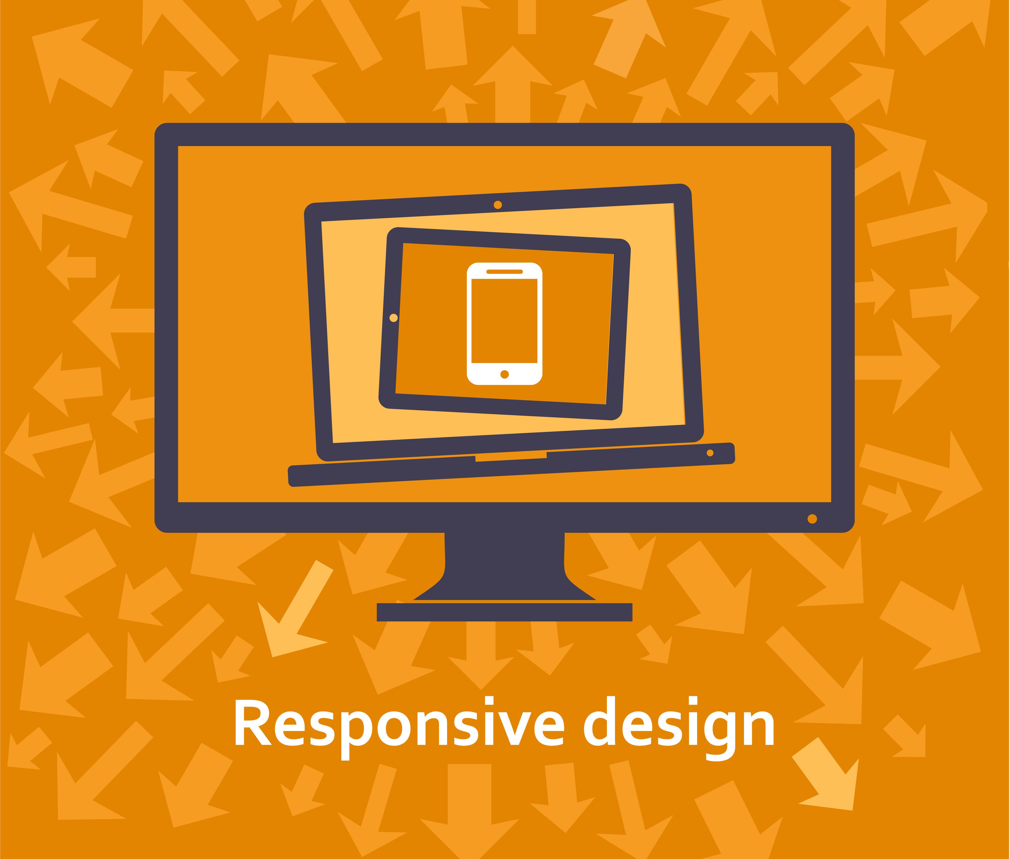

The internet has forever changed how patients search for and interact with their dentist. We live in a time where a prospective new patient’s first impression of your practice is your website. And as the internet continues to change, having an old website will leave your practice behind and ensure growth for your competition. In contrast, newly designed, responsive websites take advantage of current internet standards and technology to provide search engine optimization (SEO) that yields better search results and therefore more patients.
What is a “Responsive Website?”
A responsive website uses specialized coding that resizes, adjusts and moves key elements of a website to fit whatever screen the user chooses to view it on. Like water in a vessel, it “fills” the screen and gives visitors the best experience possible. Having a better user experience for your website starts your practice off on the right foot.

Older websites were built for older computer monitors
If you have a website that’s over four years old, it’s likely that it was built to primarily be viewed on a 4:3 square monitor. As newer, 16:9 widescreen monitors became more prominent it meant that older sites weren’t able to take advantage of the format, leaving large areas of blank space on the screen. The old square monitors haven’t been sold by any major manufacturer since 2011, which means the first impression young, tech savvy parents have of your dental practice is that you use outdated technology.
Google now favors mobile-friendly websites.
Google took an unprecedented move in April of 2015 by announcing a significant change to its algorithm that many internet marketers called “Mobilegeddon”. Websites that weren’t optimized for mobile devices began dropping in rank, while mobile-friendly sites benefited from higher rankings. Responsive websites answer this need by looking their best regardless of the brand or size of smartphone prospective parents might be using.
(Does your site pass Google’s mobile-friendly standards? Find out by testing your site here.)
Responsive websites can be viewed optimally on all devices.
In addition to smartphone optimization, tablets are now commonplace and account for a large percentage of web use. It’s important to remember that they’re relatively new. The iPad, for example, is only six years old. This rapid change in screen size means that your website needs to be able to adapt to all screen sizes, regardless of the device it’s viewed on.
It’s time for you to get a new website.
Aside from the outdated coding that hurts your website’s search performance, it’s likely that your website simply looks outdated as well. Anything longer than three years equals a decade in website design. Check out Smile Savvy’s new Quick Custom websites to see current and future standards of design and contact us to find out how we can help you update your website today.


