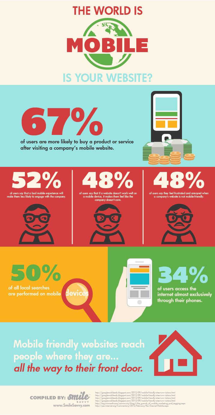

Your website is often the first impression that prospective patients have of your dental practice. With more than half of all searches for local businesses coming from a mobile device, it’s imperative that your website be user friendly. The site should load quickly, be simple to navigate and provide the most requested information up front. Respecting your patients means that you understand their on-the-go needs and that you are working to meet those needs. As the infographic below shows, if you ignore the need for a positive mobile experience, you risk sending prospective patients to another dental practice with a better online presence. Here are a few items to consider:
- Mobile sites need to function on all devices. Avoid Flash programming and animation.
- Your site should load quickly on a mobile phone.
- Your mobile site should be simple and easy to navigate.
- Buttons and navigation items should be large and easy to select using an index finger.
- Basic information (contact info, directions and “about us”) should be front and center.
- Users shouldn’t need to zoom in or out and scrolling should be kept to a minimum.
Smile Savvy provides dentists with mobile websites that place all of your practice information at your patient’s fingertips. View our full website packages and see how we can benefit your dental practice.


1 Comment. Leave new
Thanks for the fantastic advice!