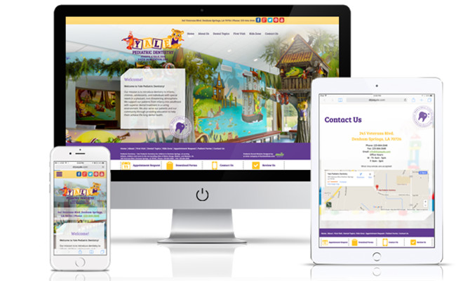

A mobile version of your website, while terrific as a quick-fix for Google’s mobile-friendly requirements, isn’t enough to future-proof your website and keep your patients happy. Instead, responsive website design is essential for dental practices that want to remain relevant and competitive online. Essentially, responsive design means that pictures, navigation menus, elements, buttons and text all adapt and move to look great regardless of the device your website is viewed on. A responsive website is essential for the modern dental practice.
The Problem
By now, you’re fully aware that all websites need to be mobile-friendly. In March 2015 Google announced that rankings for sites not optimized for mobile devices would experience a drop in search rank. This “mobilegeddon” eventually affected over 80% of all website search rankings. In preparation for this new Google requirement, many dental practices opted to “Band-Aid” their existing website by adding a smaller, mobile-friendly version of their main website. These mobile websites contain larger buttons, fewer images and a simplified format. This pared-down version of a practice’s primary website meets Google’s most basic requirements and gives patients a website version that looks better on their smartphones.
But having a separate mobile website is only a temporary solution to a problem that isn’t showing signs of stopping; tech companies continue to produce tablets and phones with new screen sizes.
The Solution
Your dental practice needs a responsive website.
What are the benefits of a Responsive Website Design?
Responsive design provides a better patient experience.
Your website is not only the first impression new patients have of your practice, it’s also an extension of your brick and mortar practice. A website that is outdated or difficult to use presents a negative image to new and current patients, even though your patient care and treatment expertise may be top notch. Patient experience begins online, before the patient ever enters your front door. A responsive website guarantees that the hub of your online presence, your website, looks and works great regardless of the device being used to find you because it is designed to adapt to any screen size.
Patients stay on your site longer because it’s easier to use.
An important ranking factor for search engines is how much time each visitor to your website spends there and whether or not a visitor interacts with your website. Known as your “bounce rate” Google looks to see if people are interested in your content. Understandably, websites that don’t look or function properly on all devices have a high bounce rate, telling Google that your visitors didn’t find what they were looking for. Aside from lowering your bounce rate, you naturally want a website that patients enjoy visiting and that doesn’t cause frustration.
Google says responsive design is an industry best practice.
While Google doesn’t provide web designers the exact formula used to rank websites in search results, they do publish industry best practices in what’s known as Webmaster Guidelines. And Google clearly says that they prefer responsive design. Since most of your new website traffic is coming from Google, it stands to reason that if Google says they want something, you should listen. You can read more about Google’s preference for responsive design here.
Instead of a separate mobile website, responsive design means you have only one website with all the same information.
Even though visitors are automatically redirected to the mobile version when using a mobile device, it’s important to note that a mobile version of your website is actually a different website than your primary desktop version.
Generally, mobile websites present only the most essential information and designers must choose which elements of the main website to leave out. An update to content on the desktop version must be made separately on the mobile version. Comparatively, responsive design provides a single website where all content can be viewed. Unless a designer specifically chooses to hide certain content, it’s all there and available to your patients.
The majority of people viewing your website are now doing so on a mobile device. Why should your mobile presence be second best?
Responsive is the new standard.
Your competition is already using it.
Responsive design isn’t the wave of the future. Instead, it is how most new websites are built around the world. It’s likely that your competition already has a responsive website. The successful growth of your practice means that you cannot ignore the mobile revolution and get left behind. Dentists cannot be satisfied with technology that is “just enough” to get by.
View our new Quick Custom website designs or contact Smile Savvy to see how we can help your total internet presence.


2 Comments. Leave new
I’m agreeing on all points here Scott. Google has confirmed as well that they’re going to boost their mobile-friendly algorithm beginning in May. This means websites that are not mobile-friendly or responsive will rank even lower than before. So if you own a dental website (or any website at that) and haven’t yet made the switch yet, the time to figure that out is now.
Thanks for the comment, Krystle!